What Do These Logos Mean? Find Out The Hidden Secret Behind 20 Popular Logos
A company hires famous designers to get their company a unique logo which in a way represents the company and its people. A creative and competitive logo takes millions of dollars to be created and we very much recognize the brand and company just by seeing the logo. But have you ever wondered what inspired these logos or how did the designer come up with the unique design?
We’ll take you through 20 such logos which are quite popular and the hidden meaning behind them is pretty interesting. These really depict a clever and impressive marketing strategy
1. Toyota
The three ellipses on the logo represent three hearts; The heart of the customer, The heart of the product and The heart of progress in the field of technology.
2. Amazon
When you take one look at the logo of Amazon you make a simple guess that the yellow arrow represents a smiley face. But there’s more it than a smiley. If you take a second and closer look you will notice that the arrow begins from ‘A’ and ends at ‘Z’ which depicts that everything you need from a to z is available on Amazon.
3. Bentley
Bentley is a popular name when you talk about luxury cars. Owned by a renowned British automaker, the ‘Big B’ logo with two wings signify the brand’s proud claim that Bentley is the closest a car can come to having wings. Smart!
A St. George Cross in the upper left corner whereas a Catalian Flag right next to it, the Barcelona Logo is inspired by a uniform. The team colors, blue and red, are displayed in stripes at the bottom. These colors are said to be inspired by the Merchant Taylor School team uniform or possible the two Robespirres First Republic.
5. McDonald’s
The popular logo visible from afar can be easily recognized and cannot be failed. But in the 60’s, McDonald’s decided to change their logo but their design consultant and psychologist advised against it and insisted that they stick with the Golden Arches. According to BBC, he said customers will unconsciously recognize the logo as “symbolism of a pair of nourishing breasts.”
6. MasterCard
The red color in the MasterCard logo symbolizes passion, courage and joy. The yellow color symbolizes optimism, richness and prosperity.
The BMW Logo evolved from the circular Rapp Motorenwerke logo with the combination of blue and white colors that were inspired by the Flag of Bavaria. On the contrary, rumors say that the BMW Logo portrays a propeller from a time when BMW would manufacture aircrafts.
Samsung in Korean terms means “Tristar” which is where the word was originated from. The earlier versions of the Logo featured three stars in various formats and colors. A basic oval shape was rotated to about 10 degrees from the x-axis that produced a sense of dynamic tension. The result was an outer shape that can be easily noticed as a spotlight crystallizing the brand name.
9. Pepsi
One of the most known logos is the Pepsi Brand Logo. The Globe of the Pepsi logo is designed as a swirling red white and blue design like a sphere in shape. it is considered one of the world’s most recognizable corporate trademarks. The Pepsi Globe originated in 1940s and became the official icon and symbol for Pepsi.
10. FedEx
The shipping company FedEx has a logo which takes a rather simple look with only its’ name written in a simple font. But, if you take a closer look at the space between “E’ and “X’. you would notice an arrow. The meaning of this arrow is speed and precision.
11. YouTube
YouTube was founded in February, 2005 in San Bruno, California by former PayPal employees, It was later acquired by Google Inc. for $1.65 Billion in November 2006. The YouTube logo features the alternate Gothic Font Family.
12. Mercedes-Benz
The Mercedes-Benz logo is the most confident of all. The Tristar represents the company’s dominance in quality and style over all things land, sea, and air.
VAIO is a renowned brand by Sony for Laptops. The logo is very much stylized and refers to turning analog waves into a digital format.The analog waves are represented in the “V’ and ‘A’ and ‘O’ which also means 1 and O that are two binary digit codes. Very clever, isn’t it?
14. Google
Who doesn’t know Google? But do you know what the colors behind the very style Google mean? The Google logo holds four primary colors in a row and then broken by a secondary color. This was not a mistake and very much intentional. Google represents a very fun and playful side and also shows that it doesn’t play by the rules to make a logo look bulky. That’s why they used simple font and colors and voila! Google!
15. Adidas
The Adidas logo portrays a mountain -like image that tells people to overcome obstacles in order to move ahead. Initially, the logo just had 3 stripes and never meant anything. So they kept the 3 stripes and changed the design a bit to make it look slanted in order to resemble a mountain.
16. Audi
Each hoop represents the 4 founding companies of the Auto Union Consortium way back in 1932: like DKW, Horch, Wanderer, and Audi.
IBM’s logo has hidden meanings for the whole world. The white lines passing through give the appearance of the equal sign in the lower right corner, representing equality
18. Volkswagen
The ‘V’ stands for “volks” which means people in German and-and the ‘W’ stands for “wagen” which means car. It’s the car for the people.
19. NBC
NBC was once known as the Peacock Network when the bird was first used as its logo in 1956. The peacock has now evolved to this with its 6 colored tail and the meanings are: News, Sports, Entertainment, Stations, Networks, and Productions.
20. Wikipedia
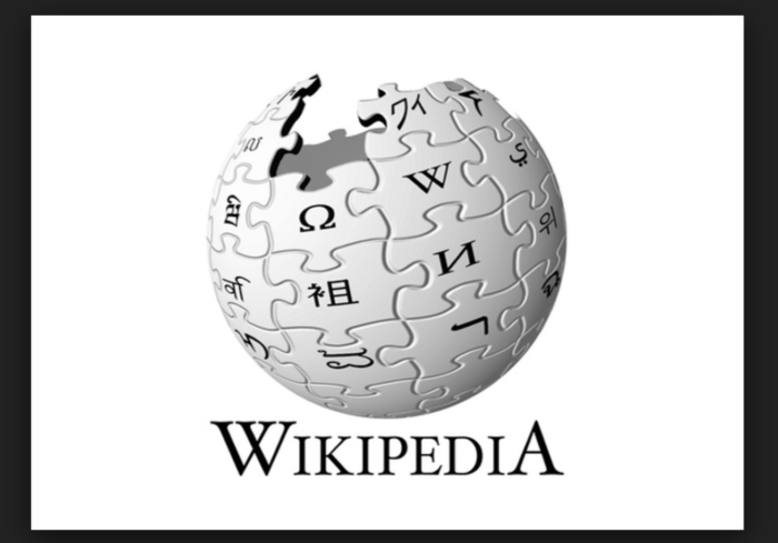
Each piece bears a glyph (a letter or other character), or glyphs, symbolizing the multilingualism of Wikipedia. As with the Latin letter ‘W’, these glyphs are in most cases the first glyph or glyphs of the name “Wikipedia” rendered in that language. The empty space at the top represents the incomplete nature of the project, the articles and languages yet to be added.”
Don’t forget to share it with your friends, I know it won’t be in your finals but it’s surely a good information.

