
There are several big companies in the world, which have lots of impact in our day to day life. You see lots of logos of big companies on daily basis, but you rarely care to know the meanings behind these logos.
In order to make you aware emblems of famous companies, we give you the reasons behind these famous logos in the world. Check out the article, to know the 12 Unknown and Amazing Facts about Famous Logos in the World. We are going to give you secrets and myth if any regarding these famous logos.
1. Wikipedia
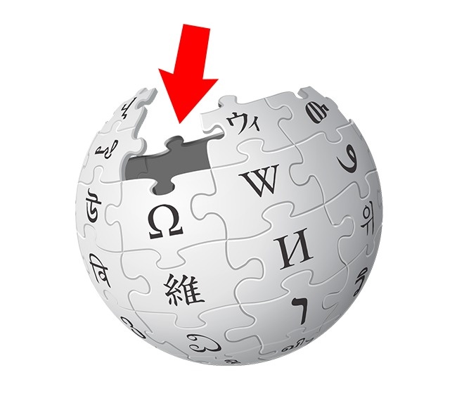
The logo of Wikipedia shows earth with puzzle pieces. Each of the puzzle pieces features the letters of different languages. If you combine all the letters, it makes up for the word “Wikipedia”. Some of the missing pieces in the logo suggest that the encyclopedia is not finished it and is constantly getting updated.
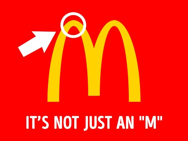
2. McDonald’s
McDonald hired psychologist Louis Cheskin in 1962. He suggested him to replace the “Speedee The Cook” logo by The Golden Door making an “M”. He thought that the shape of the new logo resembles female breasts, which arouses appetite and reminds people of their childhood. One more important thing is that Cheskin didn’t invent the new arches himself; they were in the restaurants since the 1950s.
3. Apple
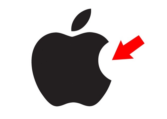
The logo of Apple is not a secret to anyone. Some of the reports suggest that the Apple Logo was dedicated to Alan Turing, as he died by biting into a poisoned Apple. But it is not facts folks. The Apple logo was designed by Rob Janoff, who designed the bitten apple logo in order to distinguish it from rest of the fruit. He believed that the full Apple can be confused with any other round fruit.
4. Android
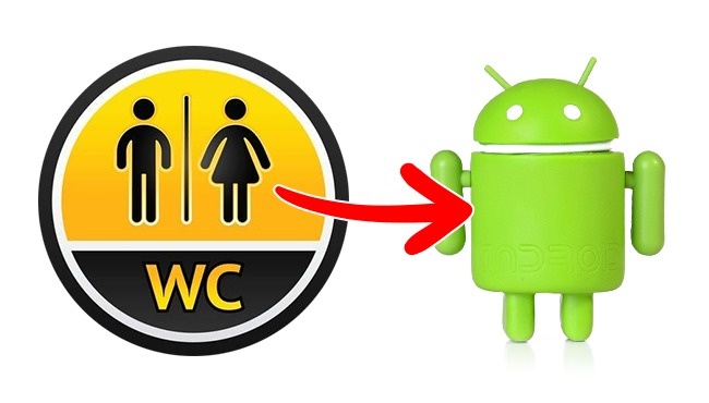
Graphic designer Irina Bok and his team, who created the Android logo, were asked to create a logo representing a robot that would be recognized. The inspiration for Android was from the symbols on the doors of public bathrooms.
5. Pinterest
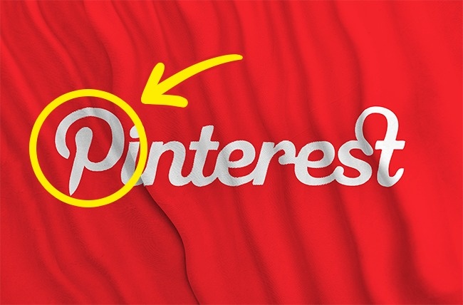
Pinterest is a web and mobile application company, which operates a software system designed to find information on the World Wide Web. The logo of the company seems very simple, but if you look closely you will find something which you never noticed. The first letter of the logo looks like the pin that is used for papers and photographs. The logo is fitting, as it literally pins pictures to walls not physically but electronically.
6. Lacoste
Rene Lacoste was walking on the street with his team captain, Alan Moore in 1923. He then noticed a crocodile skin suitcase at windows of a shop. Lacoste and Moore made a bet that if Lacoste would win the next game, he would gift him that suitcase. Lacoste lost the bet, but a journalist aware of this story wrote an article about a tennis player, who lost but “fought like a crocodile”.
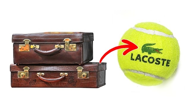
This is how Lacoste got his nickname. Later his company received the logo of this amazing reptile.
7. BMW
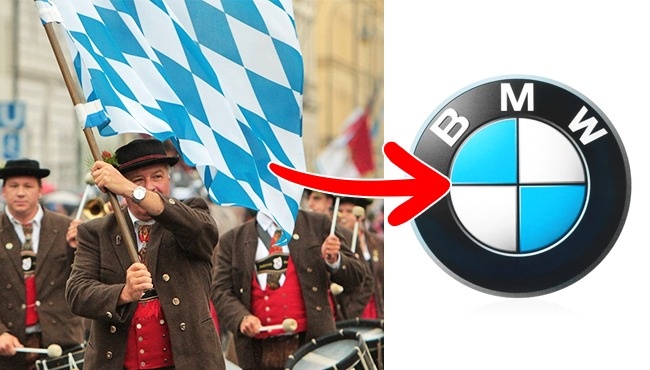
BMW is known for making luxurious cars, but did you know the meaning behind its logo. According to the rumors, the logo of BMW symbolizes the airplane propeller. Some of the employees even believed in the rumors, but the real reason is pretty simple. The blue and white colors of the BMW logo were picked to represent the colors of Bavaria.
8. Ferrari
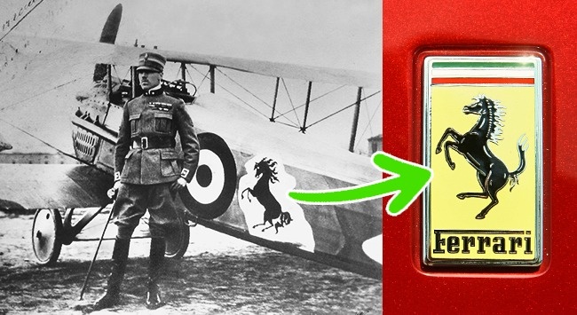
According to the biography Enzo Ferrari, horse silhouette was painted on the plane of popular Italian pilot Francesco Baracca. Francesco’s mother gave the horse silhouette to Enzo after he won the race. Now, the Ferrari logo has become very popular.
9. Uber
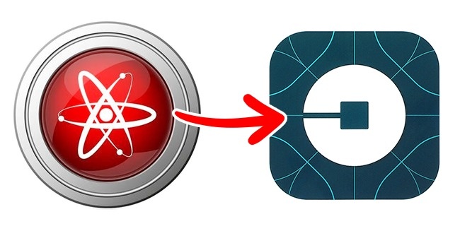
Uber has found lots of success in all around the world. The company develops, markets and operates the car transportation and food delivery mobile apps. The company has recently changed its logo from U to something similar to bits of information or atoms. According to the company, the new logo is the symbol of their cars that can be found anywhere like the atoms or bits.
10. Pepsi
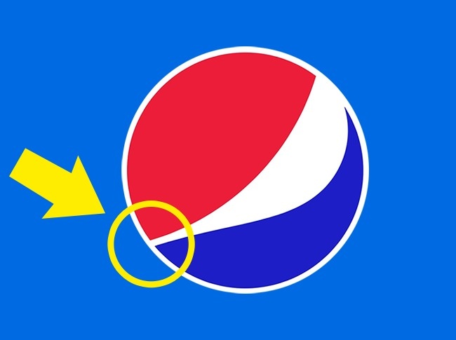
Come on man do I need to tell you about the company Pepsi. The logo of the company seems to be pretty simple, but it costs owner lots of money folks. The Pepsi logo costs $1 million. The designer responsible for the logo designed it according to the proportion of the golden ratio, which is considered most sweet and pleasant for the eyes.
![]()
There is one more version of the story, which is rather funny. The above image perfectly describes the after-effects of the drink, especially if you consume too much.
11. Nike
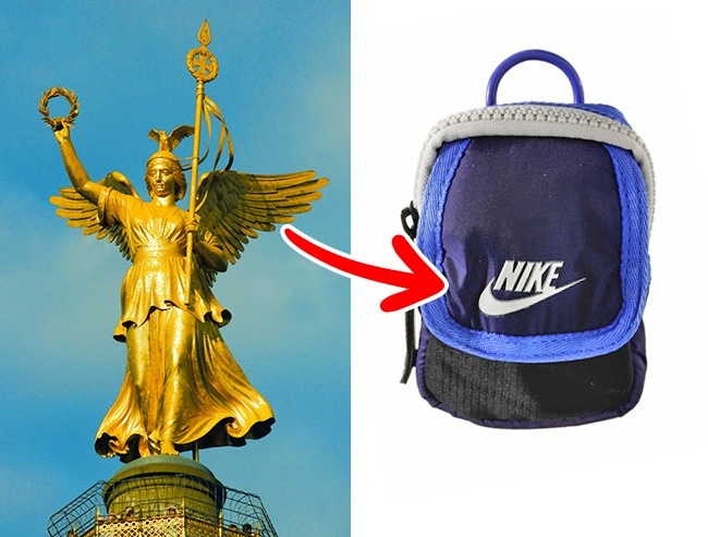
Nike doesn’t need any introduction, the company is one of the most popular companies in the world. Can you believe that the most popular logos in the world is also the cheapest? Yeah, you heard it right folks, founder of Nike Inc., Phil Knight paid $35 to the student Carolyn Davidson for the logo in 1971. At first, he wasn’t even happy about the result. The Nike logo is one of the most famous logos in the world as of now. More often, the logo is associated with the wing of Nike, the Greek Goddess of Victory.
12. Starbucks
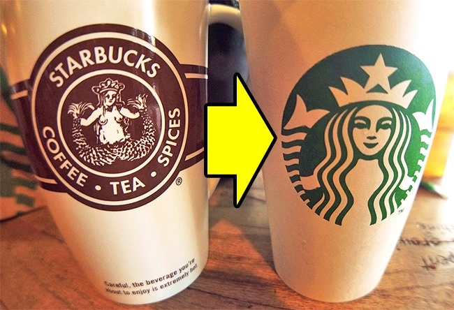
You may be aware of this: the logo of Starbucks shows a mermaid holding 2 of her tail fins. This logo was inspired by the myth of the fairy Melusine. Melusine was a woman fish with two tails, who married a mortal man. The company put the whole picture of the mermaid on the coffee cups in 1971, but it was censored later.
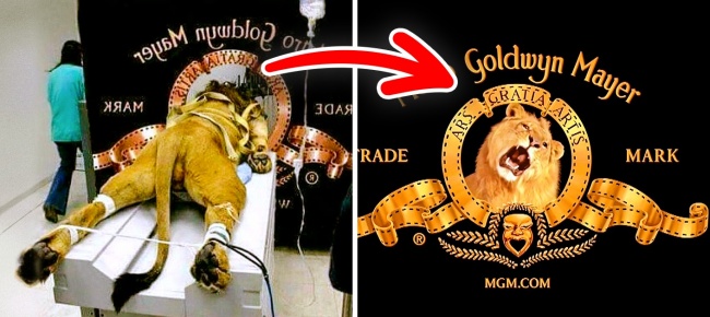
13. Metro Goldwyn Mayer Lion logo
The above picture is totally false folks; this is not how the company got their famous logo. MGM has a very interesting roaring lion logo, which looks very amazing and realistic. When you look at the MGM logo, no one notices that the studio has used 7 different lions for MGM logo. MGM has referred to all the lions as “Leo The Lion”. These lions were properly trained for roaring at a particular clue. As far as the above picture is concerned, it is a fake. The picture is pretty famous on the web, but it is not how MGM get their logo. The lion in the above picture is preparing for an MRI scan.